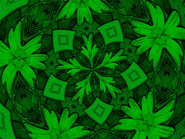
The past couple days haven't been suitable for photo hiking trips. It's been cloudy and off and on showers. And we need the rain badly so I'm not ungrateful. So instead of new nature hikes today, I played around with a photo in Coral Paint Shop Pro X. The first photo is the original, the second is a kaleidoscope version, and all the rest experimentation with another effect on the kaleidoscope version. Feel free to point out any you like or dislike and why. I like to hear what my viewers think. [The last photo looks best viewed from a distance of say six to ten feet away from the computer screen and looks best in its large version.]
I don't get it. You took a perfectly beautiful picture and made it into something that could have been wall paper or cloth for a woman's dress back in the 70s... I hope you know this is in jest!
I think I need to fully join the digital age and get some software to edit the digital pictures that I am collecting.
I guess I like the Hot Wax version and the Balls and Bubbles which has a Christmas feel to it as someone previously mentioned. But like Sage was alluding too, I don't think I would hang them up as prints but rather make some custom made wrapping paper or screen savers. Now the original would definitely hang well on a wall.
Hi, san nakji. I think sometimes what makes a picture attractive is what function one is wanting it to fulfill.
Hi, sage. Your jesting is perfectly fine. I think the fun I get out of this is that I enjoy making and viewing different patterns, shapes, and colors. In some sense, my appreciation for it has to do with its geometric and abstract qualities.
Hi, fred. The kaleidoscope version is beautiful. And I like the brightness of the original version.
Hi, kevin stilley. I agree and I like the Christmasy feeling of the balls and bubbles version.
Thanks, cergie. Do you think the original appeals most because it is the most real or most representative of what exists in nature?
Hi, abandoned in pasadena. The foil version does have its attraction. I used Corel Paint Shop Pro X in this exercise
Hi, ed abbey. I think you're right. My transformations work best as wrapping paper or screen saver designs rather than the normal picture one would put on a wall.
Balls and Bubbles have my vote, apart from teh original of course. The third one, is a bit too dark for me and reminds me of East-german wall paper. Scary stuff :)
Oh the green one has my vote even though they look like paintings from the cartoons, i love the original one and am always up for experimenting with photos and seeing what comes out. :)
Not for that reason, the original is less... HUUummm... stiff ! The other picture may perhaps be used such as wallpaper in your kitchen. However... Look out nightmare ! Ouah ! Ouaf ! Ouais ! ;-D
Hi, minka. Balls and bubbles probably is my favorite, too. The one that is too dark for you I wouldn't want as wallpaper either. I like bright colors to be around me most of the time. But darker views have their place just on a lesser basis.
Thanks, merili. It was fun experimenting with the original photo. It gives one a sense of many possibilities or potentialities.
Hi, murf. The fur picture is the most difficult one to appreciate with its blurry feel. But yet it pulls me.
Hi, san nakji. I agree that the more one views the fur picture the more it pulls. But I can't look at it too long. It is also disturbing in some sense.
Hola, coral. Me gusta que te gusta mis fotos de las flores amarillas. Un abrazo, coral.
Hi, ginnie. Naw, can't ever have too much fun playing around with photos! Glad you loved the colors of the foil version. They do go well together.
Thanks, nabeel. Glad you enjoyed my play with these pictures. :)
Hi, mreddie. God's work is always superior to man's work. But since man is created in the image of God, some of God's glory shines through man's work.
Hi, deepak gobi. Glad you enjoy my photos. You are welcome to visit anytime here.
Thanks, cergie. It is true that with the exclusion of the original these pictures follow strict geometric patterns. Perhaps you enjoy more spontaneity. :)
My main blog: Ramblings generally focuses on telling a story via photography and words. These stories generally center around family, nature, and church although sometimes just about life in general. I also have a blog entitled Fingerprints. I post less frequently in Fingerprints. It serves as a catch all of anything that does not go in my Ramblings blog including memes, quizzes, and reports on books and movies.
The road awaits
Time doesn't
The road beckons
Time steps forward
Will we move
In step with time?
Will we step forward
Shaping our time?
Will we take time
To see the present?
Will we explore the past
And understand our heritage?
Will we laugh?
Will we wonder?
Will we touch?
Will we feel?
Time flies on
We have choices
Shall we go fast?
Shall we go slow?
We shall go forward
But we will choose the pace
We may dance with all our heart
Or bathe ourselves in a setting sun


20 comments:
Well original is usually the best, especially when nature is concerned. However, I really like the colours in coloured foil!
I don't get it. You took a perfectly beautiful picture and made it into something that could have been wall paper or cloth for a woman's dress back in the 70s... I hope you know this is in jest!
I like the kaleidoscope version. And, the original, too.
Balls and Bubbles has a Christmassy feel to it.
Oh ! The one of favorite flowers of Monet !
I prefer as usual the original picture.
But I like too this flower painted by Monet.
AHAHA !
I like playing with pictures too. What program are you using to create your pictures?
Of course you always start with a great original picture, but in this instance I like the foil next.
I think I need to fully join the digital age and get some software to edit the digital pictures that I am collecting.
I guess I like the Hot Wax version and the Balls and Bubbles which has a Christmas feel to it as someone previously mentioned. But like Sage was alluding too, I don't think I would hang them up as prints but rather make some custom made wrapping paper or screen savers. Now the original would definitely hang well on a wall.
Hi, san nakji. I think sometimes what makes a picture attractive is what function one is wanting it to fulfill.
Hi, sage. Your jesting is perfectly fine. I think the fun I get out of this is that I enjoy making and viewing different patterns, shapes, and colors. In some sense, my appreciation for it has to do with its geometric and abstract qualities.
Hi, fred. The kaleidoscope version is beautiful. And I like the brightness of the original version.
Hi, kevin stilley. I agree and I like the Christmasy feeling of the balls and bubbles version.
Thanks, cergie. Do you think the original appeals most because it is the most real or most representative of what exists in nature?
Hi, abandoned in pasadena. The foil version does have its attraction. I used Corel Paint Shop Pro X in this exercise
Hi, ed abbey. I think you're right. My transformations work best as wrapping paper or screen saver designs rather than the normal picture one would put on a wall.
Balls and Bubbles have my vote, apart from teh original of course. The third one, is a bit too dark for me and reminds me of East-german wall paper. Scary stuff :)
Oh the green one has my vote even though they look like paintings from the cartoons, i love the original one and am always up for experimenting with photos and seeing what comes out. :)
The more I look, the more I like the fur one!
Flores Amarillas, mis preferidas...
Preciosas fotografias.
Un Abrazo Tim.
8/28/2006 07:12:07 PM
You had way too much fun with this, Tim. HA. I like the colors of the foil version. LOVE those colors together :)
ohh great work .. i am glad that u posted the before and after pics .. i loved the third one .. great design work. Sunflowers always face the sun :)
Very interesting work and colors - I still like the original best. ec
Excellent,Marvellous,Astounding
I dont know why I simply love your posts.I will always visit here
Thanks a lot for your visit too
Not for that reason, the original is less... HUUummm... stiff !
The other picture may perhaps be used such as wallpaper in your kitchen.
However... Look out nightmare !
Ouah ! Ouaf ! Ouais !
;-D
Hi, minka. Balls and bubbles probably is my favorite, too. The one that is too dark for you I wouldn't want as wallpaper either. I like bright colors to be around me most of the time. But darker views have their place just on a lesser basis.
Thanks, merili. It was fun experimenting with the original photo. It gives one a sense of many possibilities or potentialities.
Hi, murf. The fur picture is the most difficult one to appreciate with its blurry feel. But yet it pulls me.
Hi, san nakji. I agree that the more one views the fur picture the more it pulls. But I can't look at it too long. It is also disturbing in some sense.
Hola, coral. Me gusta que te gusta mis fotos de las flores amarillas. Un abrazo, coral.
Hi, ginnie. Naw, can't ever have too much fun playing around with photos! Glad you loved the colors of the foil version. They do go well together.
Thanks, nabeel. Glad you enjoyed my play with these pictures. :)
Hi, mreddie. God's work is always superior to man's work. But since man is created in the image of God, some of God's glory shines through man's work.
Hi, deepak gobi. Glad you enjoy my photos. You are welcome to visit anytime here.
Thanks, cergie. It is true that with the exclusion of the original these pictures follow strict geometric patterns. Perhaps you enjoy more spontaneity. :)
These are really nice!
Hi, rrramone. Thanks. I had fun creating them. :)
Post a Comment