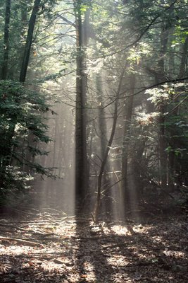
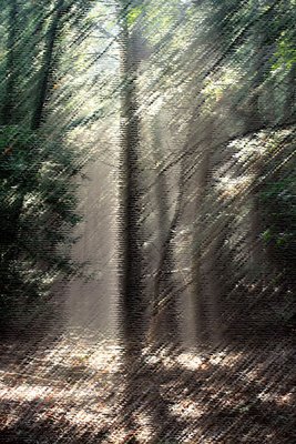
I like to view the rough pastels and the dry brush pictures best in their enlarged format. With the enlarged format the texture of the pictures ooze with life.

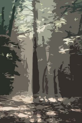
I like the cut out and dark strokes pictures for their imaginative elements. Both of them could tell many stories with just a bit of creativity. And the dark strokes picture seems to possess strong emotion or strong forces of intent.
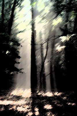
And as an ending comment have you ever noticed when visiting art museums how some pictures look better from a distance than close up? I have. And in my opinion the pictures in this post also look better from a distance than when sitting directly in front of a computer monitor.


19 comments:
I liked the dry brush, but I still liked the original the best!
Sorry!
Hello, I liked the forest but if I were there I would be so scared.
The first picture is the best one.
The first spoke to me of the light of the love of God breaking through the darkness of this present world and to me the best one. I have absolutely no idea how to do these other things, though they are interesting. ec
Very cool. Each has a unique feel to it. But, in the end, I think I am with Ava. I like the original the best.
Funny, Tim, but I really like the Cut Out best of the 4 effects. It looks like a silk screen. I hardly ever take the time to play around with Adobe PS effects. Hmm. Maybe you're motivating me!
Ditto on the original.
The cut out picture looks like army camouflage material... MMMM ! Not a success I think !
Let me tell you I prefer when I can see trees and not hurt them in a forest !
So definitely, I prefer the original picture ! Sorry !!!
I read that everybody has the same opinion ! Poor misunderstood artist !
Yeah, I like the dry brush affect too...lovely photo!
dry brush too. you can play more with it and make it look really scary. Play with some gaussian blur (from filters) and then in the layer tool box hit "multiply".
I'm wondering for those of you who express a strong preference for the original whether you enjoy impressionist art at an art museum. Or would you generally avoid such museum art galleries? Just curious. There is no right or wrong here.
Hi, ava. No need to apologize; we all have differing levels and continuums of likes and dislikes.
Hi, camila bernades. Glad you liked the forest. But I love being in a forest; it has a way of bringing me close to God. I probably fear more in my everyday world than I do in the forest. ;)
Hi, mreddie. I love how the first picture spoke to you. That's a neat thought. Don't worry about not knowing how to respond to the others. I appreciate your presence here.
Hi, kevin stilley. Do you like the original the best in part because it is most true to the visual reality behind it? Part of what I like about the other pictures is that they communicate beyond what is in the original? Does that make sense to you?
Hi, ginnie. Go, have a try at it. I don't play around with effects all that much. But every once in a while, I get into a mood to do so.
Hi, ed abbey. Thanks for coming by. From the comments, I think there are a lot of people who agree with you. If I had to choose between the two for all time, I'd choose the original, too. But since I can have variety, I enjoy that variety from time to time.
Hi, cergie. Thanks for your comments. You made me chuckle a bit. Actually, while I see how the cut out effect could make one think of the army, it made me think more on an imaginative Tolkien type level. With just a little imagination, I can begin to see a whole new mythical world there. :)
Thanks, tai. I enjoy hearing what people like the most.
Thanks, chloe. I did a bit more playing around as you suggested and beyond. I like it!
The original picture is great, but if I had to choose one from your photoshop, I'd choose the cut out. I like them all though...they each speak differently to me.
Rough pastels would be my choice, I think.
I really have to get Photoshop!
Lovely pics!!! liked most the brush one:)
Hope u doing fine.
Takecare
I like the pastels one, and also the dry brush one, but yes, the original is still the best. It's gorgeous.
I have been fooling around with some of my flower photos with Microsoft Photo Editor recently so I will probably use your post as inspiration to make a post of those at some point.
Hi, abandoned in pasadena. I, too, think that each one has a different message or messages to speak.
Hi, minka. Thanks for identifying your favorite. Photo Shop is a great tool. I wouldn't want to be without it.
Thanks, samrina. Glad you enjoyed the pics.
Thanks, spidergirl. I believe the majority of people like the original the best. Glad I could be potentially of inspiration to you for your blogging. :)
I love the original photo with the light shining down and the cut out version. I am taking a photo shop course in the fall look what I may be learning! I too take photos of trees and when I look at the photos they DO SPEAK to me in fact before I take the photo the tree beckons me to stop and take a photo! I see you experience this too!
I guess to answer your question, I like going to art galleries but I've never been one to get obsessed with them. I have never been able to spend more than a couple hours in art museums like the famous ones in London without getting bored. However, whenever I go to the state fair photography competition building, I can lose myself for hours on end. Especially when viewing nature photography like your most recent post.
Thanks, ed abbey. I think I understand where you are coming from. Most of the time my photos will be reflecting nature as it really is or as close to that as I can get. But I probably do have a bit more interest in an impressionist view than some.
Hi, naturegirl. I'm glad you enjoyed this post. And, yes, nature does speak to me in so many different ways.
Hi, murf. It would be neat to have the full PhotoShop program; but for now that is too expensive. But you made me laugh when you said that could make me dangerous. I actually could be dangerous now if I wanted to just with the software I have. :)
Post a Comment